Onboarding Experience
Commerce7 offers direct-to-consumer tools made specifically for wineries. Their software provides ecommerce, point of sale, wine club, and reservation tools that all put a high focus on providing the end-customer with the best experience possible.
When a client signs up with Commerce7, they’re put in contact with one of the members of our team. They go through some training and have recurring calls to check-in, but there are quite a few steps before they are ready to launch and start selling. While the current process was working, it was taking too long for clients to launch and required a lot of time from our staff. With Commerce7 continuing to grow, we knew that we would need to make the process a little more self-serve and offer more robust tools within the platform. The goal was that this would not only help internally, but would also give clients additional resources and make the process easier and smoother, reducing reliance on us.
Company
Commerce7 (Completed during employment)
Timeline
2 months from planning to launch (Jul - Sept 2021)
Tools
Balsamiq, Survey Monkey, Sketch
Role
- Led the design and planning for the project, working with the head of product/development and 2 members of our onboarding team to gain insights and for final approval and sign-off.
- Worked with the backend and frontend developer to hand off the designs and provide assistance with QA until launch.
Defining the project
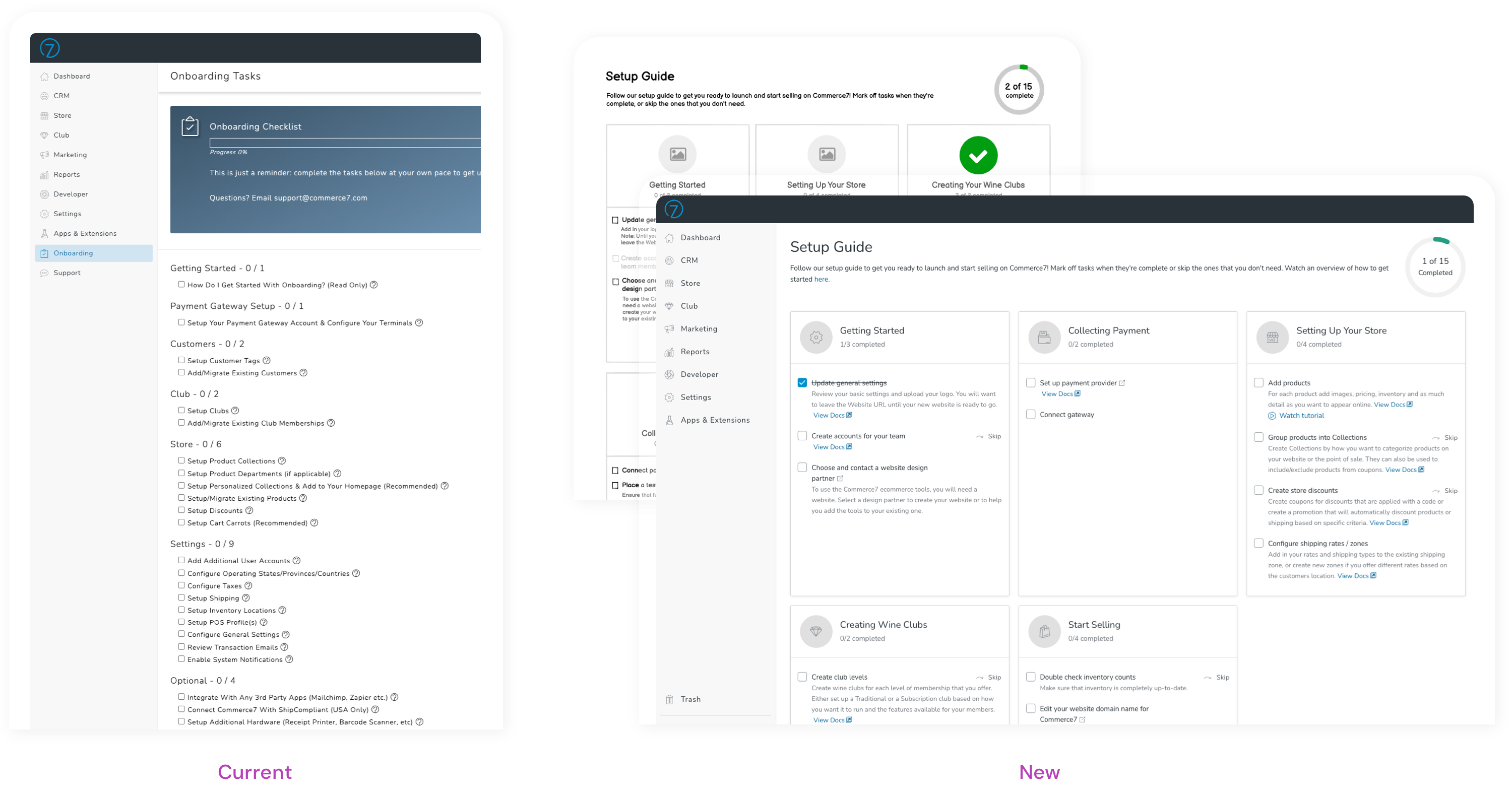
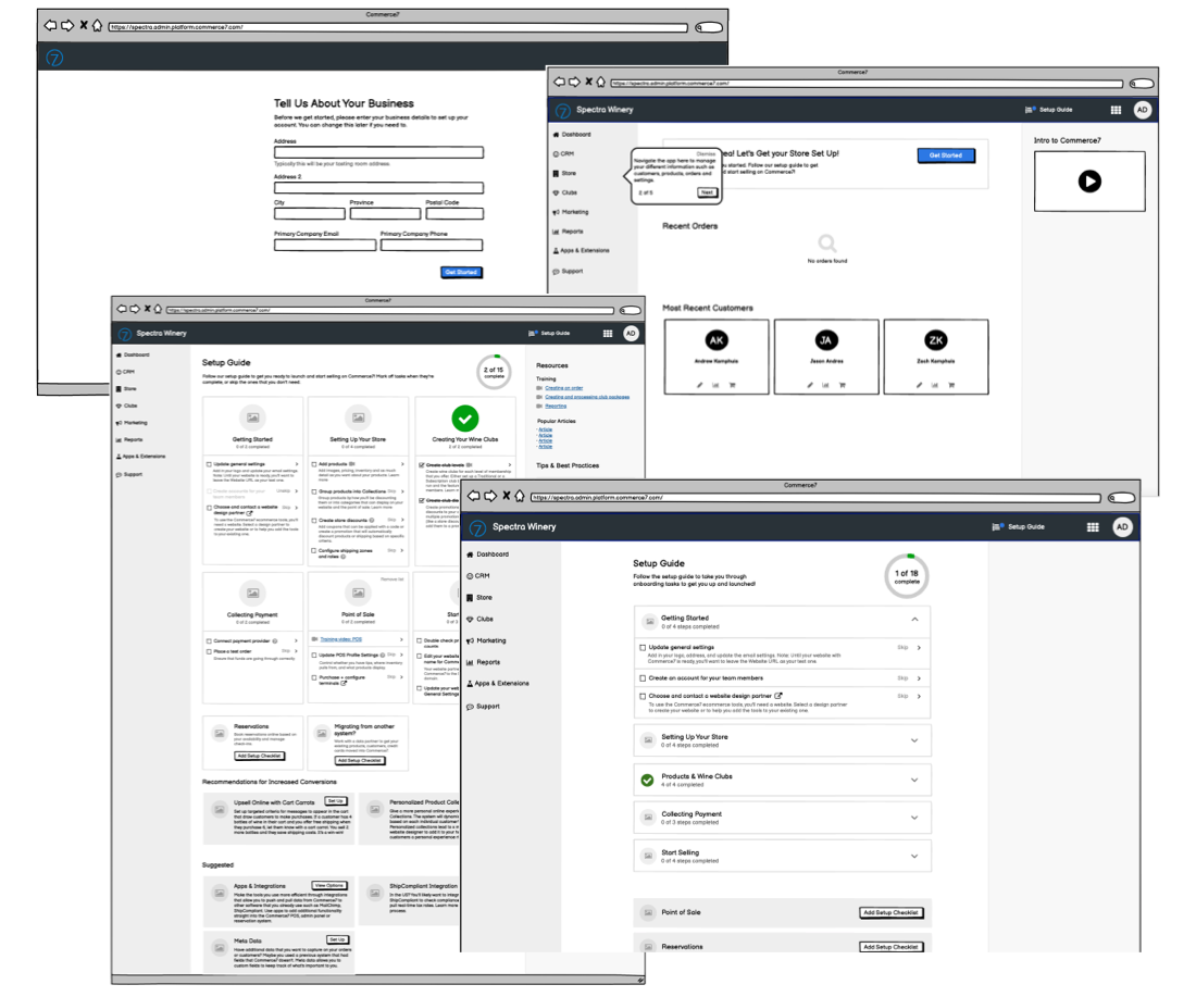
We already had a dedicated page in our Admin called Onboarding. This page housed a long checklist of tasks for clients to complete prior to launch. Each task could be clicked to go to the corresponding help article and then checked as it was completed. On the Dashboard and from the Onboarding page, clients could see a summary of how far they were to completing all of the tasks.
We knew the page needed a refresh and that we wanted to review the existing checklist items, but there were no specific requirements. Before designing an improved onboarding experience, I needed to understand the problems that the current process had, in addition to any areas that were working well for clients already.
Process
- Review the current interface and make notes of potential problems
- Uncover and validate problems by learning from our team & clients
- Specify project requirements & deliverables
- Create wireframes, design mockups, & create copy
Gaining insights
I began by reviewing the current onboarding experience from a client’s perspective to uncover any potential problems or areas for improvement. I also talked with the Onboarding team to understand where they thought the biggest problems were and what they wanted to accomplish with the new design.
I sat in on 7 onboarding calls, held 3 client interviews, and sent a survey to recently launched clients that yielded 70 responses.
Problems
- Support was unmaintainable - The current onboarding process required too much attention from our onboarding team. This would not be maintainable as we continued to grow.
- Process was overwhelming - It was overwhelming for clients to know how everything worked or where to get started without the 1:1 time with our team.
- Complex tasklist - The current task list was built as a “one size fits all” solution. Each client didn’t require the exact same setup steps so there were many that could be skipped or ignored, bloating the list and making it seem more complicated than it was.
- Long launch timelines - Launch timelines were longer than expected both for clients and our team. Sometimes it was unavoidable, but other times it was delayed due to not getting started with external parties soon enough (such a website designer or a payment gateway).
Goals
- Get clients launching quicker and/or with less 1:1 time required from our team
- Provide a better introduction to the platform, easing clients in
- Simplify and tailor the checklist
Addressing the problems
The first step was completing an audit of the current tasks in the checklist or “onboarding guide”. These tasks were essential to the onboarding experience and directly impacted how smooth, easy, and fast the process was for clients. From there, we could work off of the list to refine the guide and accomplish the rest of the project goals.
Reviewing the checklist
In the initial research, many clients offered the feedback that they loved the task list, so we knew that we had a good start, but we also knew that there was room for improvement. This is where the redesign process began.
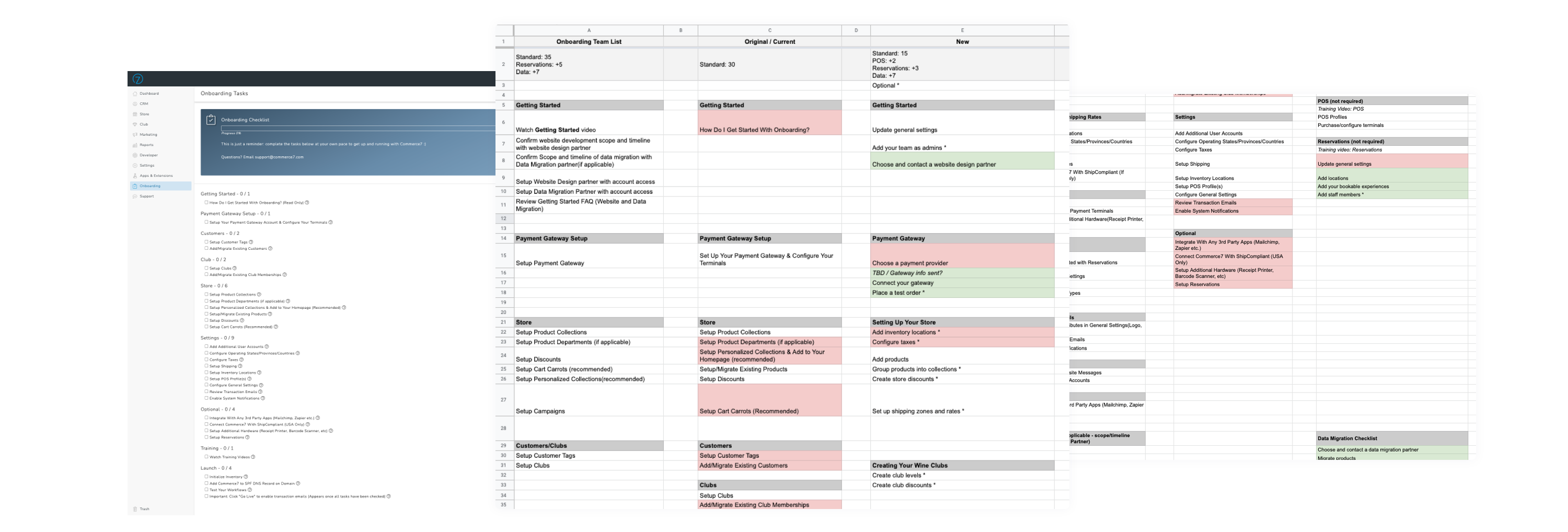
Our current list consisted of 30 tasks, but there were 17 new tasks that the Onboarding team wanted to add in addition based on setup or features currently missing. Our goal was to simplify the checklist, but make sure that it still touched on all of the key aspects of setting up the software. Working with the Onboarding team, we went through and determined which tasks were necessary to launch and if any could be combined or removed.
Easing clients into the platform
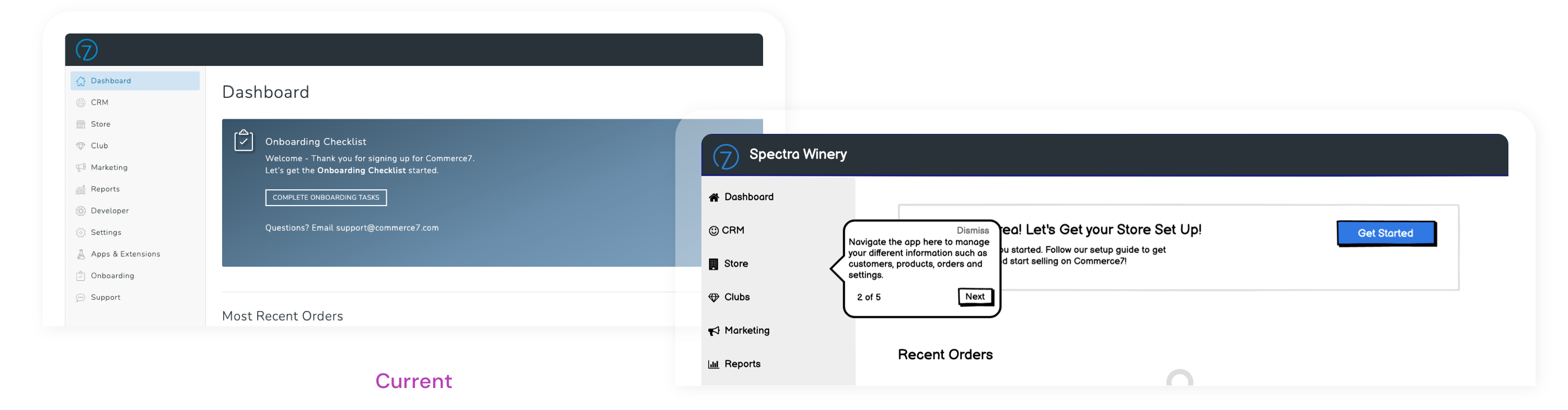
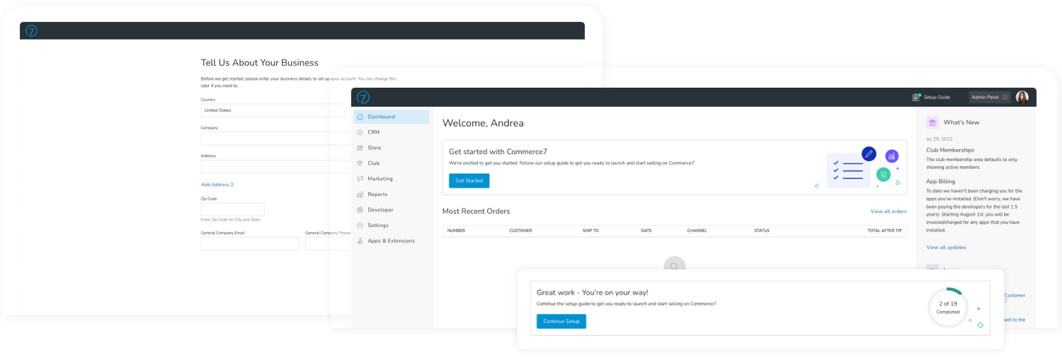
The initial welcome
When a client logged in for the first time, on our dashboard they saw a card for an “Onboarding Checklist”, but they had no real introduction until they talked to someone from our onboarding team.
I wanted to reduce that initial overwhelming feeling of not knowing where to start, and replace it with a little interaction. Introducing a couple of tooltips to appear only on a user’s first login would give them a short intro of the tools and more of a sense of where to start.
To avoid them being a nuisance, I limited the number to 5 basics:
- Accessing the different applications
- Main navigation
- Viewing their website
- The "Setup Guide"
- Getting support
Creating better milestones
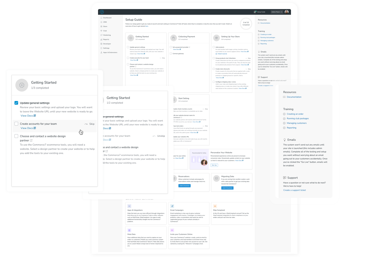
The current list was just that, a list. I wanted to present each set of tasks as a “block” on the page. This would help break up the list into more distinct milestones, but would also help convey that the task categories didn’t necessarily have to be completed from top to bottom.
For each individual category, I listed the number of completed tasks and total tasks for each. Once a category was completely finished, its icon would update to a checkmark. The end result was less of a “list” and more of an interactive guide.
Decreasing time to launch
Removing “recommended” or optional tasks
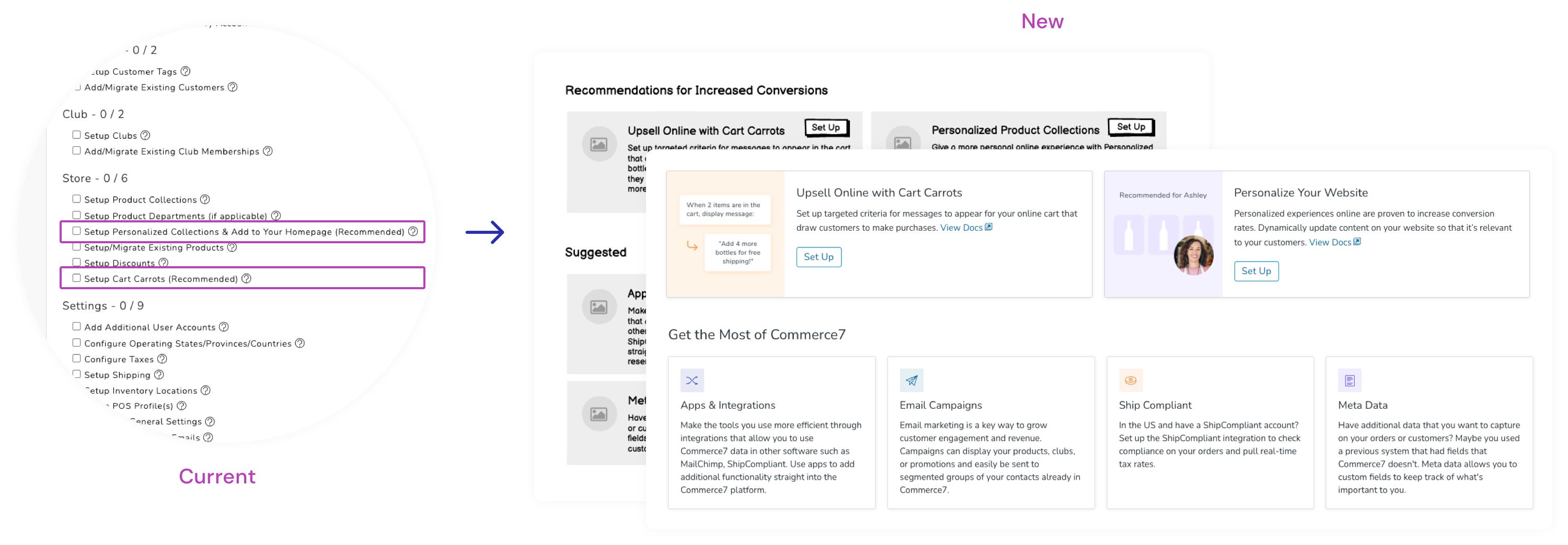
While we were able to immediately weed out some optional tasks, there were some that we used to prompt clients to try specific features that were beneficial for conversion rates. While presenting them in the task list brought awareness, listing them alongside the essential items wasn’t the answer.
After some discussion amongst the team, we came to a consensus that everyone was happy with. These items would be removed from the task list and presented as cards and tips on the page. Not only would this allow clients to focus on tasks that they needed to complete, but it would also give us the opportunity to provide additional information on the tools themselves in a more visual way.
Introducing some automation
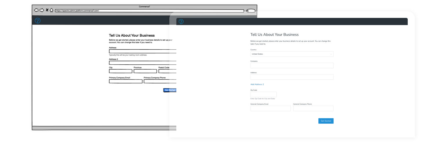
Four tasks involved clients entering or double-checking their business information throughout the system. These tasks would be replaced with a new form that clients would be presented on their first login. The information that they entered would be used to automatically populate the system, saving them time, and making that checklist smaller.
Reorganizing tasks
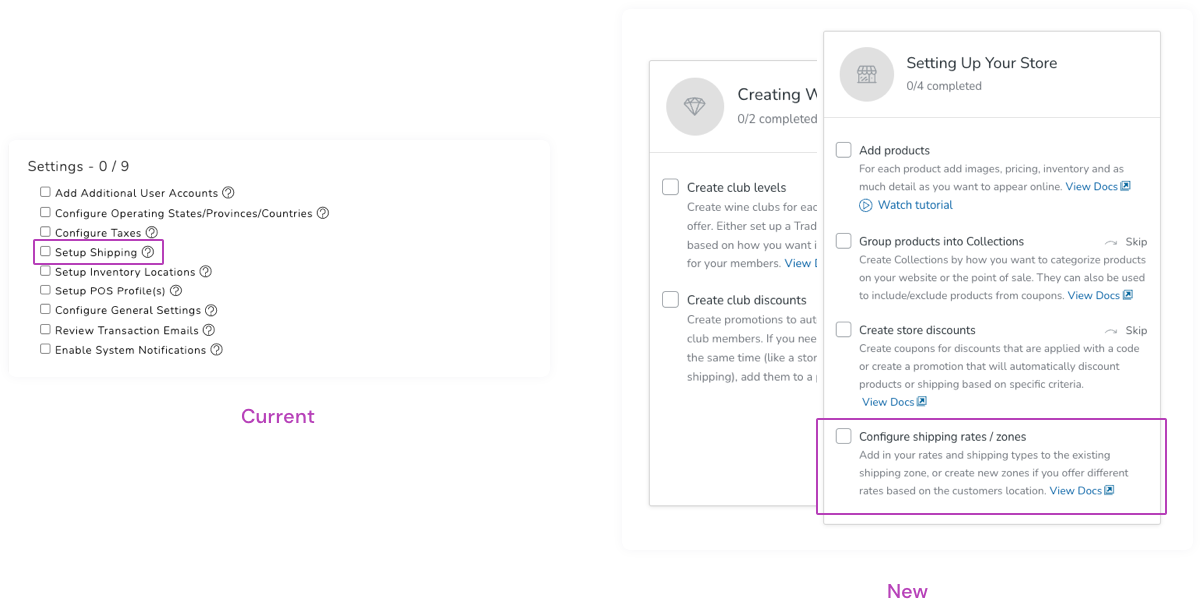
Items were currently grouped by areas that they were completed in. For the most part this made sense, but some shifting of the categories allowed them to be more task driven.
The current categories:
- Getting Started
- Payment Gateway Setup
- Customers
- Club
- Store
- Settings
- Optional
- Training
- Launch
The new categories:
- Getting Started
- Collecting Payment
- Setting up Your Store
- Creating Wine Clubs
- POS
- Reservations
- Data Migration
- Start Selling
Based on the initial research, an area that quite often took longer than expected was website design or data migration. This takes place with external parties. Sometimes the timeframe was unavoidable, but other times, the process could have been started earlier. To encourage exploring these sooner than later, we presented them earlier on in the checklist.
After a couple of revisions, we narrowed down the list to a total of 29 tasks.
Tailor the list to client needs
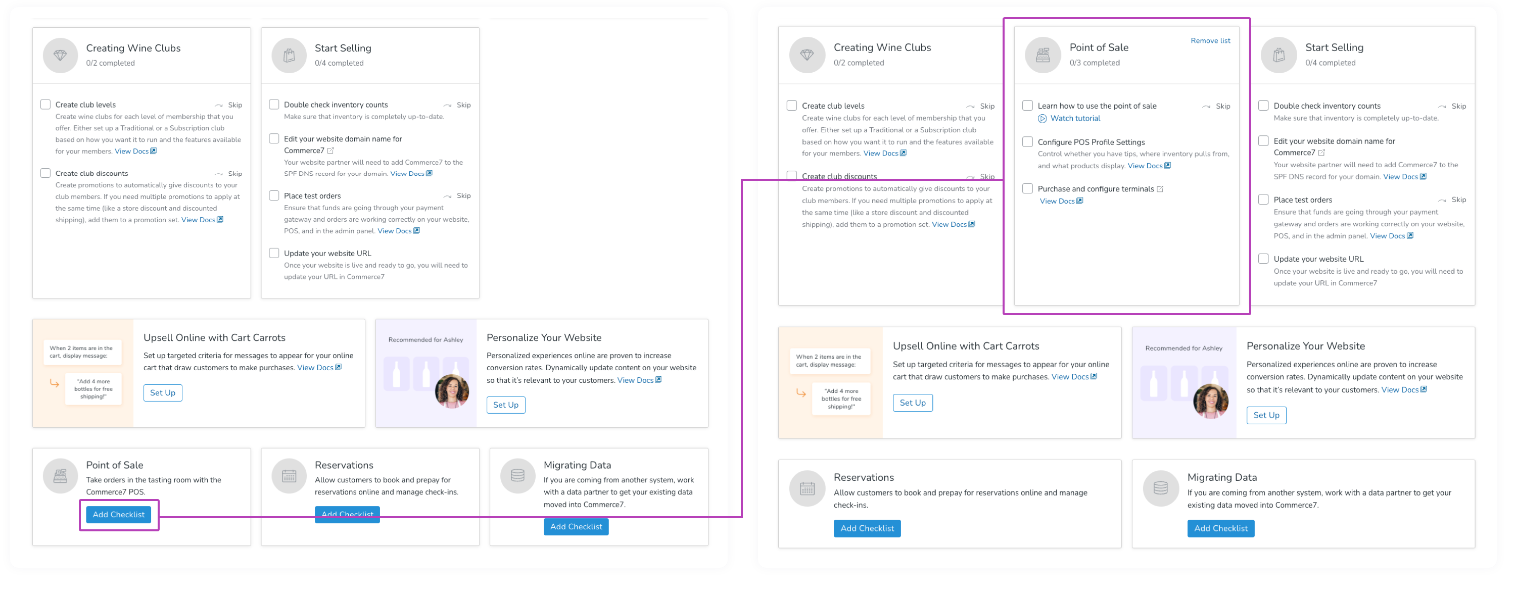
Part of the reason that there were still quite a few tasks, is because we were trying to make the setup process work for every client. Our current checklist covered the bases for our entire platform. While there were some steps required by everyone, if a client didn’t plan to use a specific featureset, other steps could be ignored. I wanted to allow customization based on client needs so that each could be focussed on their own goals.
After separating the tasks out and individually grouping by each “theme”. Clients would all start off with the same base tasks, and would have a couple of options to add to their checklist as they saw fit.
This allowed our base checklist to sit at 15. I know I’m getting a little fixated on the number, but when you log in to software for the first time and you see 15 steps to set it up, how does that make you feel in comparison to seeing 29 off the bat? Pretty different, I’d say.
Increasing self-sufficiency
Obviously a key attribute of how easy it is to onboard a platform has to do with the platform itself, but it also has to do with how it’s introduced. I needed to make the onboarding experience and tasks a little easier to understand.
Each task was already linked to a corresponding article on our help site, but I created descriptions and also wanted to include links to any existing video tutorials. For a couple of areas where clients often had confusion, I reviewed and updated the current articles, or created ones if they didn’t exist.
To go along with the new guide, I created a new article so that clients could follow along from the help site and reference all of the instructions from there as well.
Final design
I started with wireframes, listing out all of the content that was essential to include on the page. This was done hand-in-hand with many of the items above. I started playing with how all of the pieces would come together and I looked into other platforms for inspiration. After working through through a couple of different versions, I came to one that myself and the team were happy with.
Login
- On logging in for the first time, new clients see a form where they can fill out basic information about their business. This information is then taken by the system and pre-populated in multiple areas of the system automatically.On the Dashboard, clients see a series of tooltips highlighting the main areas of the system.
- Users see a prompt on the Dashboard to work on the setup guide. If they’ve already gotten started they’ll see a different version with their overall progress.
- The guide can be accessed at any time by clicking the link in the top right of the header.
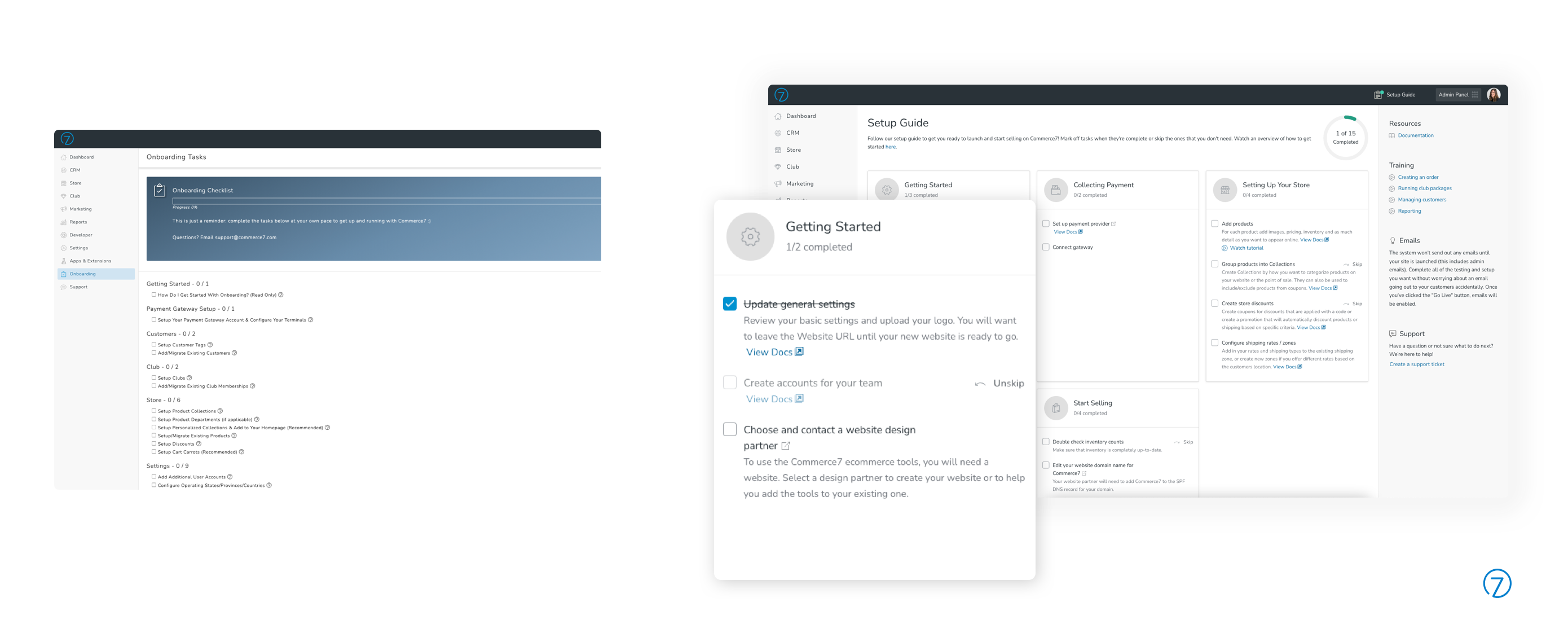
Setup guide
- By default, clients have 5 categories of tasks to complete with 3 optional categories that can be added on.
- Each task can be clicked to navigate to that area in the admin panel and checked when complete.
- Although we removed most of the optional tasks, any that were strongly recommended, but not technically essential, were given the capability to be “skipped”. Skipping a task greys it out and removes it from the total number of tasks left to complete.
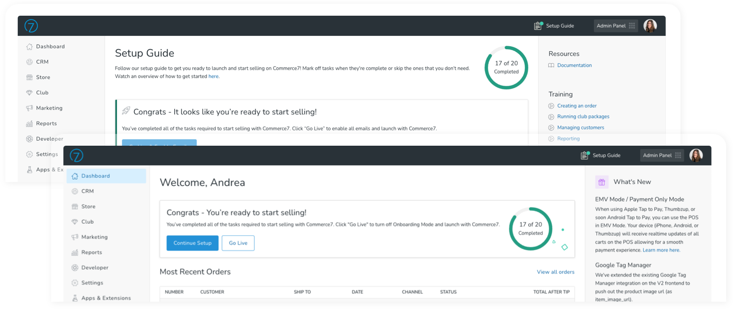
- As users complete and check tasks, the progress bar updates.
- Along with the individual task article links, the new sidebar adds some extra help, tips, and articles.
Going live
- Once all required tasks are completed, a new banner displays at the top of the guide and the Dashboard allowing them to “Go Live”.
- Clients can choose if they want to close the setup guide, or continue working on some of the optional items.
Conclusion
The response has been a positive one. Overall, the new setup guide is much more interactive and visual and gives a better introduction to new clients.
Since we’ve gained many new clients since the release of the updated guide, we can’t say that the time to onboard clients has gone down, but we are taking on more as a team. Over time, as the Onboarding team works with and launches more clients, we continue to adjust verbiage and refine tasks as needed.