Point of Sale Redesign
Commerce7 offers direct-to-consumer tools made specifically for wineries. Their software provides ecommerce, point of sale, wine club, and reservation tools that all put a high focus on providing the end-customer with the best experience possible.
In a busy tasting room, wineries need to complete transactions as quickly as possible. With our current point of sale, we knew that there was room for improvement in regards to the speed and steps required to complete a transaction. Additionally, we wanted to increase cohesiveness with the rest of our software and rebuild the point of sale to use our new components.
Company
Commerce7 (Completed during employment)
Timeline
2.5 months from planning to launch (Dec 2021 - Feb 2022)
Tools
Sketch
Role
- Led the redesign, working with the head of product/development to plan the new features incorporated.
- Worked with the backend and frontend developer to hand off the designs and provide assistance with QA until launch.
Homepage
The goals for the main point of sale screen was to make information easily scannable, allowing users to quickly read and find the key actions needed to start and proceed with an order.
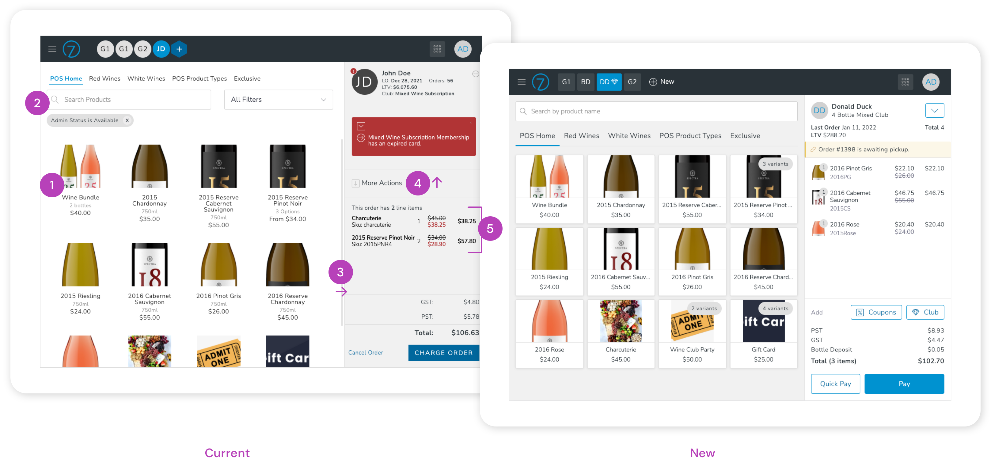
- Products - The current products felt unorganized and a little lost on the page. They were updated to a card style, making them more similar in appearance to buttons and allowing the user to see the exact amount of clickable space. As a bonus, it also allowed for the reduction of space between products, fitting more into the viewable area.
- Search - The sales associate could already search for any product, but that wasn't evident since it was presented under the product categories. It was moved up in position to better convey its functionality.
- Background - Colours were swapped so that the brighter colour, white, would be used for the primary area of focus; the current order being created.
- Actions - Previously, actions appeared in the middle of the order, but as they affected the entire right panel, they were moved to the top. The two more common actions however, for applying a coupon or creating a new club membership, were moved directly to the screen.
- Order Summary - Products in the cart were given images to visually tie them to the products on the left and the quantity was moved to help it stand out since it had previously gotten lost for products with longer names and SKUs.
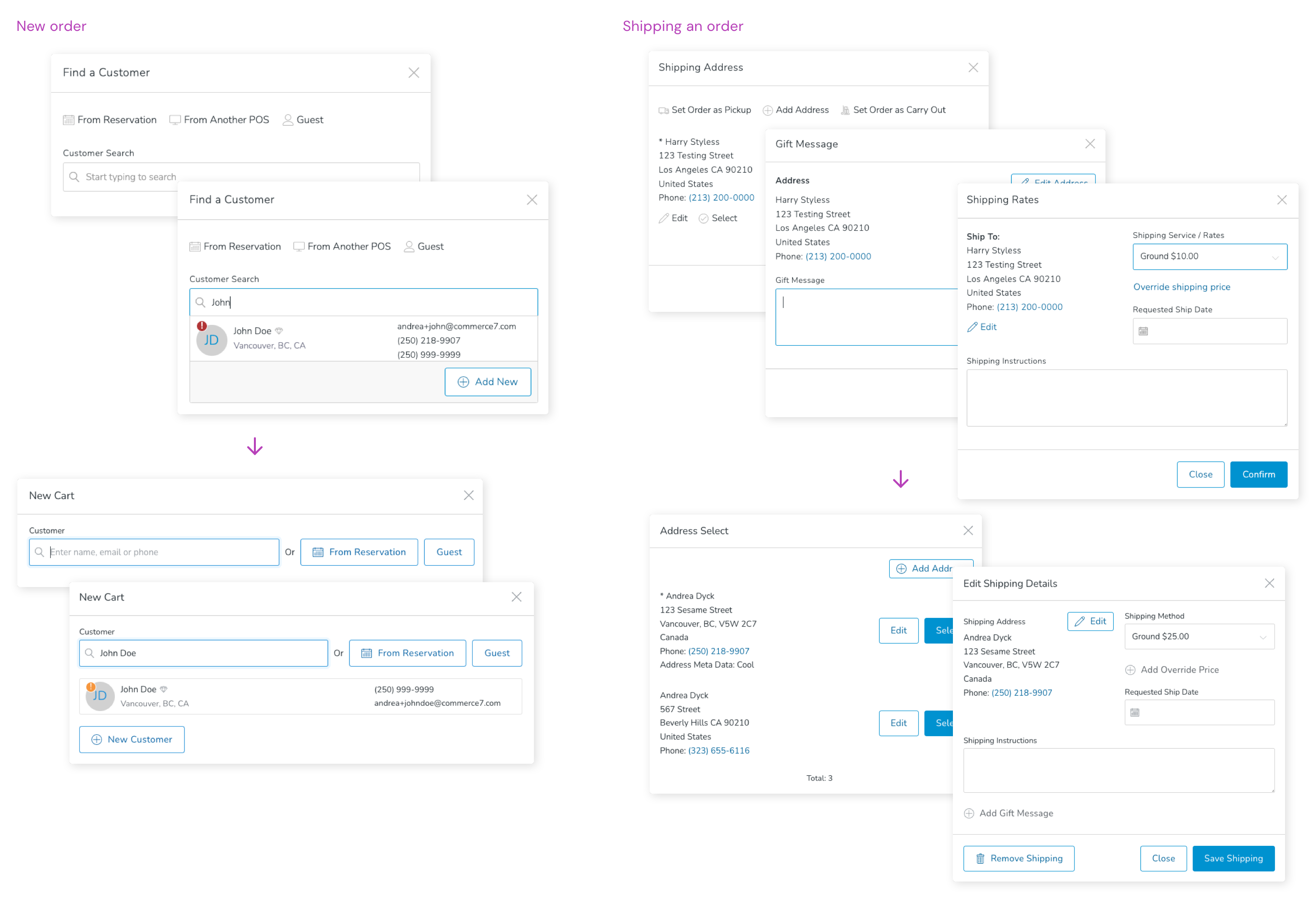
In addition to the homepage itself, all actions and modals within were given a review to increase button sizes, consistency, and reduce steps wherever possible.
Payment
With the current interface, there was a lot going on, and a lot that the user could do. They could take almost any action that they could from the home page. I wanted to ensure that the focus was kept on the current task; taking payment. Detailed information and extra actions that could be taken from the main screen were hidden and vertical space was drastically reduced from the order summary to ensure that staff could review as much of the order at one time.
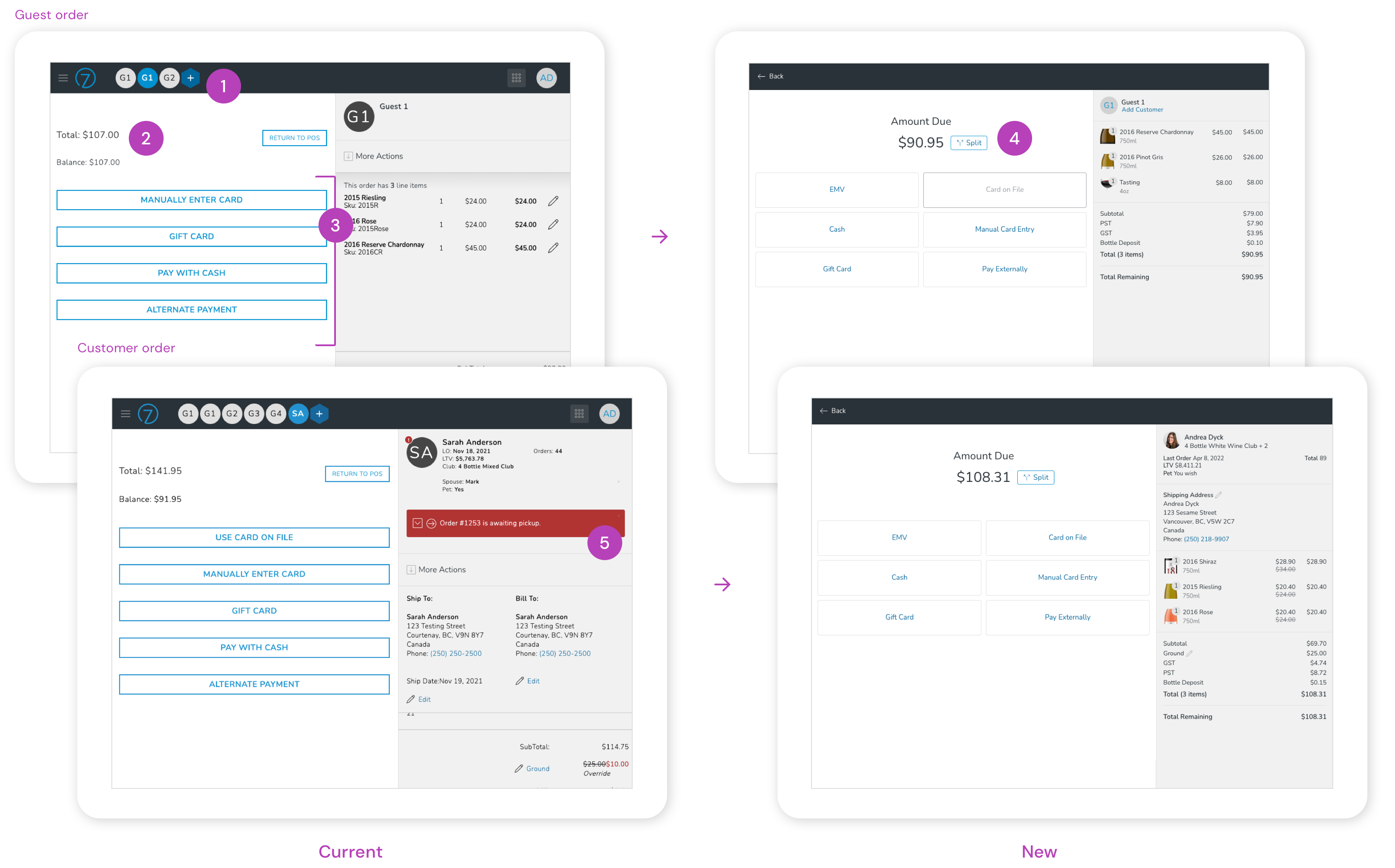
- Encapsulated Payment - Other orders at the top were hidden and replaced with a single action to go back.
- Amount Due - The total amount was made larger and the previous "balance" was now also reflected in the total if part of the order has been paid for.
- Payment Types - Buttons were increased in size and any types not available for guest orders were disabled so that buttons wouldn't shift positions for staff between orders.
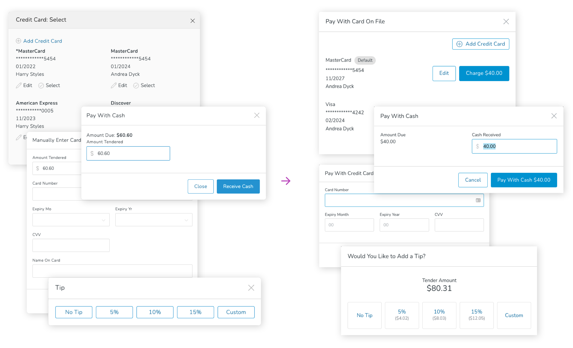
- Split Payment - Instead of first having to select a payment type to choose how much should be charged, a new "Split" option was added directly to the main screen (more on this next).
- Orders Summary - Actions and customer messages already displayed on the homepage were removed to keep the focus on payment and reviewing the order details. Space was reduced to allow the sales associate to review the entire order without having to scroll.
Partial payments
When the sales associate selected a payment type, there was always a field for "Amount Tendered". If the customer wanted to complete the order with multiple forms of payment, this is when they would enter the partial amount to be taken. Although needed in some scenarios, a very low percentage of orders were being placed with multiple forms of payment and displaying the field every time caused an extra step in the transaction process.
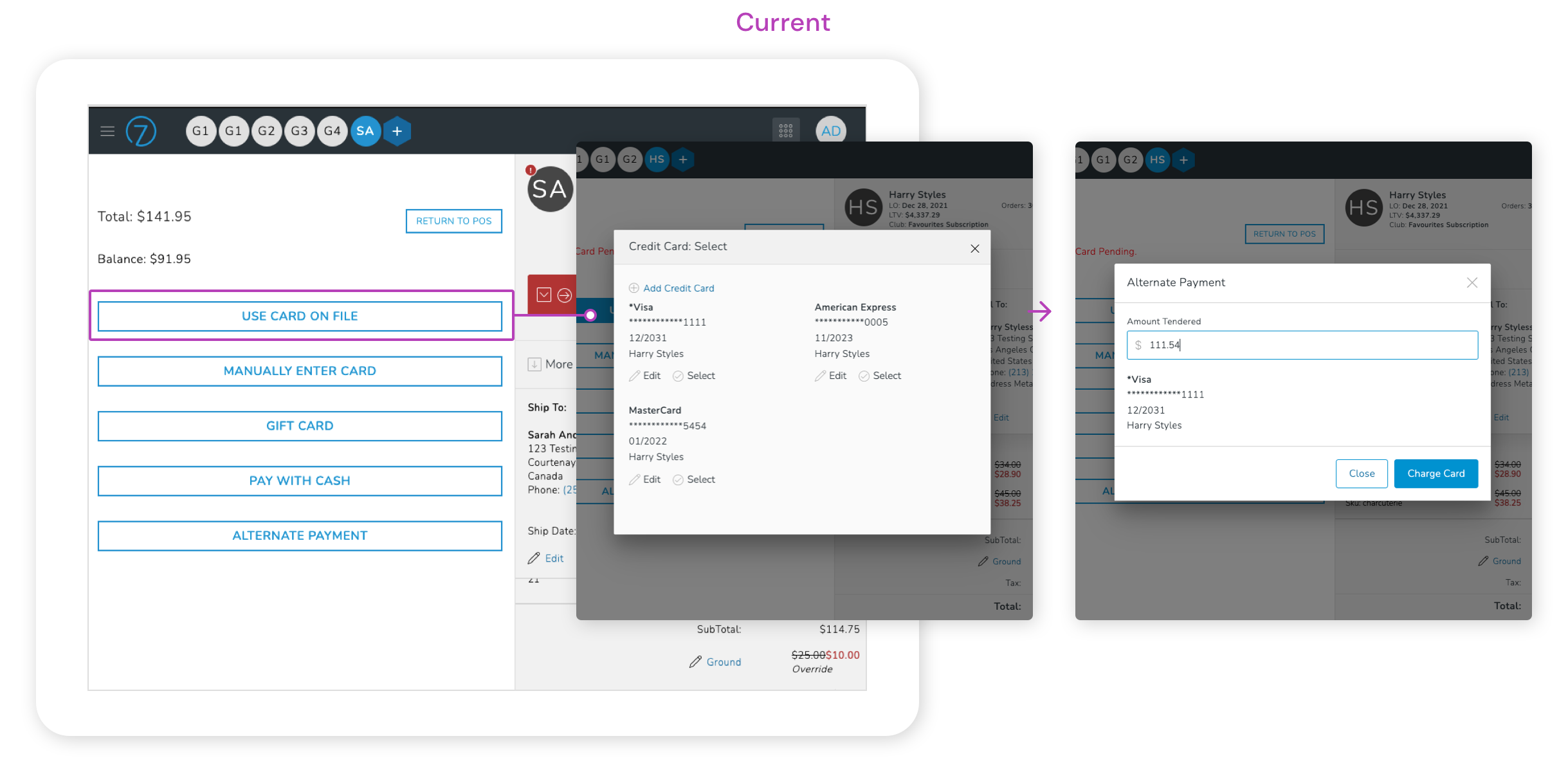
Instead of displaying the field to adjust the payment for each and every payment type, a new "Split" button was introduced. This would allow the sales associate to edit the amount if necessary, otherwise they could proceed with payment directly and skip that step entirely.
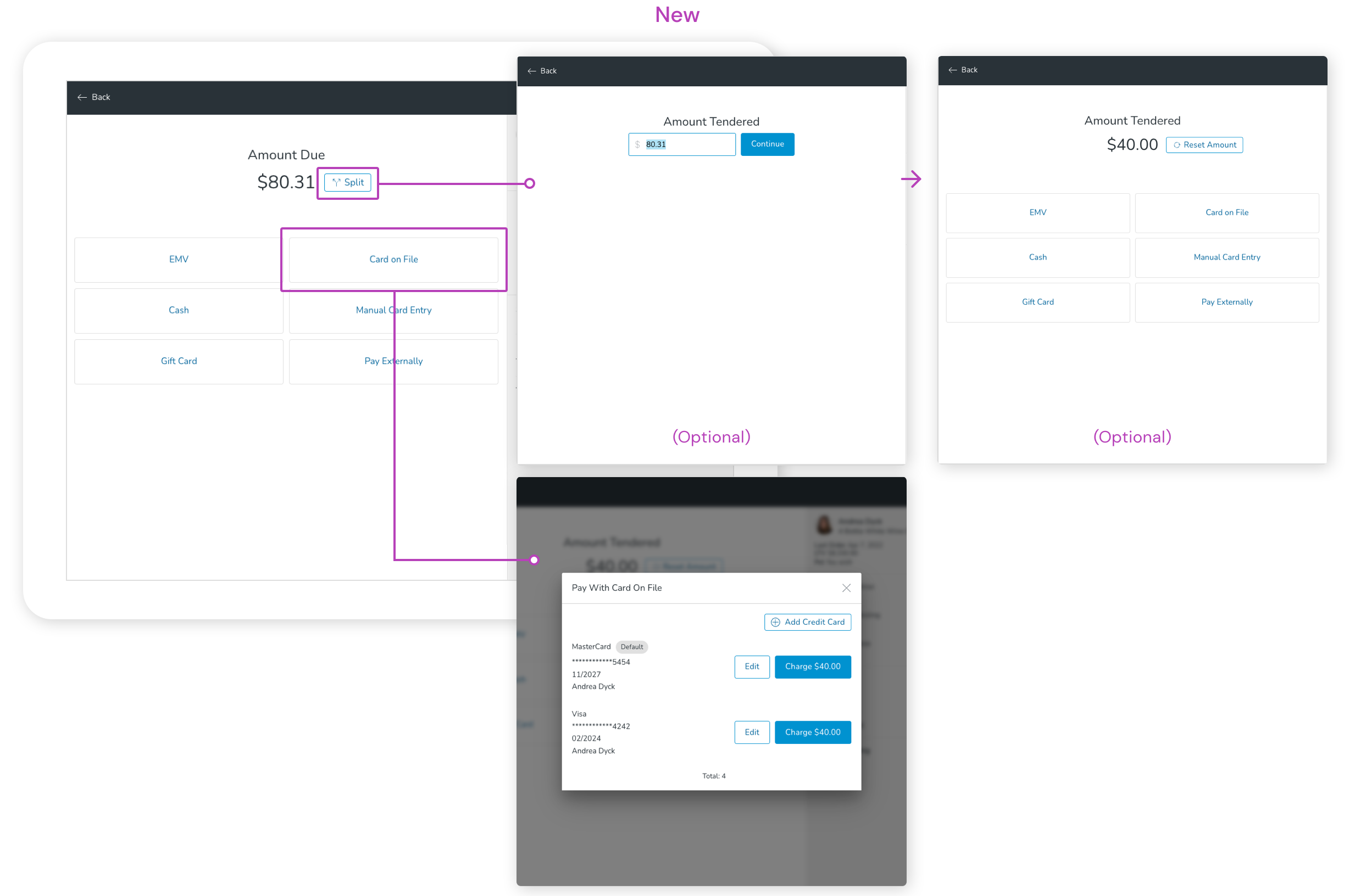
Payment types
Various forms of payment were reviewed and updated for consistency in terminology and any unnecessary information was removed.
Order Complete
When the transaction is complete, the receipt & order confirmation window opens. In the current version, there was one window if the order belonged to an existing customer, but if it didn't have a customer attached (guest order), the sales associate would be prompted with two modals, one after the other.
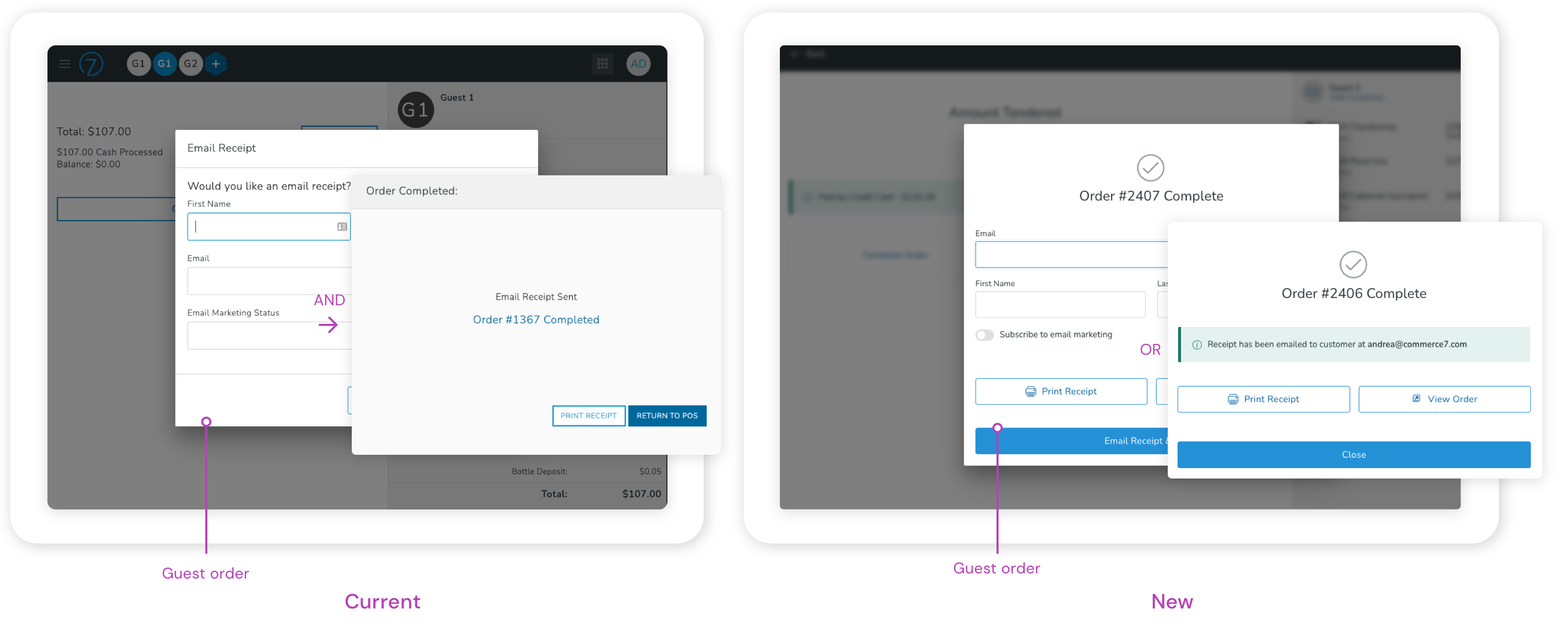
Both screens were combined into one and the user would now see a different version based on if a customer was attached to the order or not. If no customer was attached, additional data could easily be captured from the same screen. Buttons were also increased in size and given icons for easier recognition.